Azure Charts: a hidden gem for architects and azure users alike

Last week I found a little gem that is too good to keep it for myself. For years, I have been using (and working with) Microsoft Azure and in all this time and it is only now that this cool website pops up! In order to better understand what I'm talking about, I need to go a little more in detail in the design process of (cloud) architectures. In Azure, a lot of the services have been designed as components that can put to work together in multiple scenarios. When these components are being put together, they result in a solution that is more than the sum of its parts. It is however important to look at these solutions from multiple angles and take into account concepts such as scalability, cost, availability (incl SLA's), etc.
Figuring this all out, and (finally) designing a working solution is typically the work of an architect, especially in complexer situations. In any given situation one of the following methods is used to get to such an architecture:
- The system gets designed based on knowledge and/or experience ➡️ this typically requires a lot of mileage in the context of Azure
- The system has been designed before (as an example) and is made available in the Azure Architecture center . This library hosts (at the time of writing) 481 architectures which can serve as inspiration.
And then there is this third option that I want to share with you ➡️ Azure charts
Azure Charts is a creation of Alexey Polkovnikov , who is a Sr Cloud Solutions Architect at Microsoft. He has created this site outside of the Microsoft context and explicitly states here that "Azure Charts" isn't a Microsoft product and that there is no SLA.
Azure Charts is positioned as a live visual exploration environment for Azure and its goal is to make a lot of information (architectures, state, SLA's, etc) available in a compact and easy to digest way:
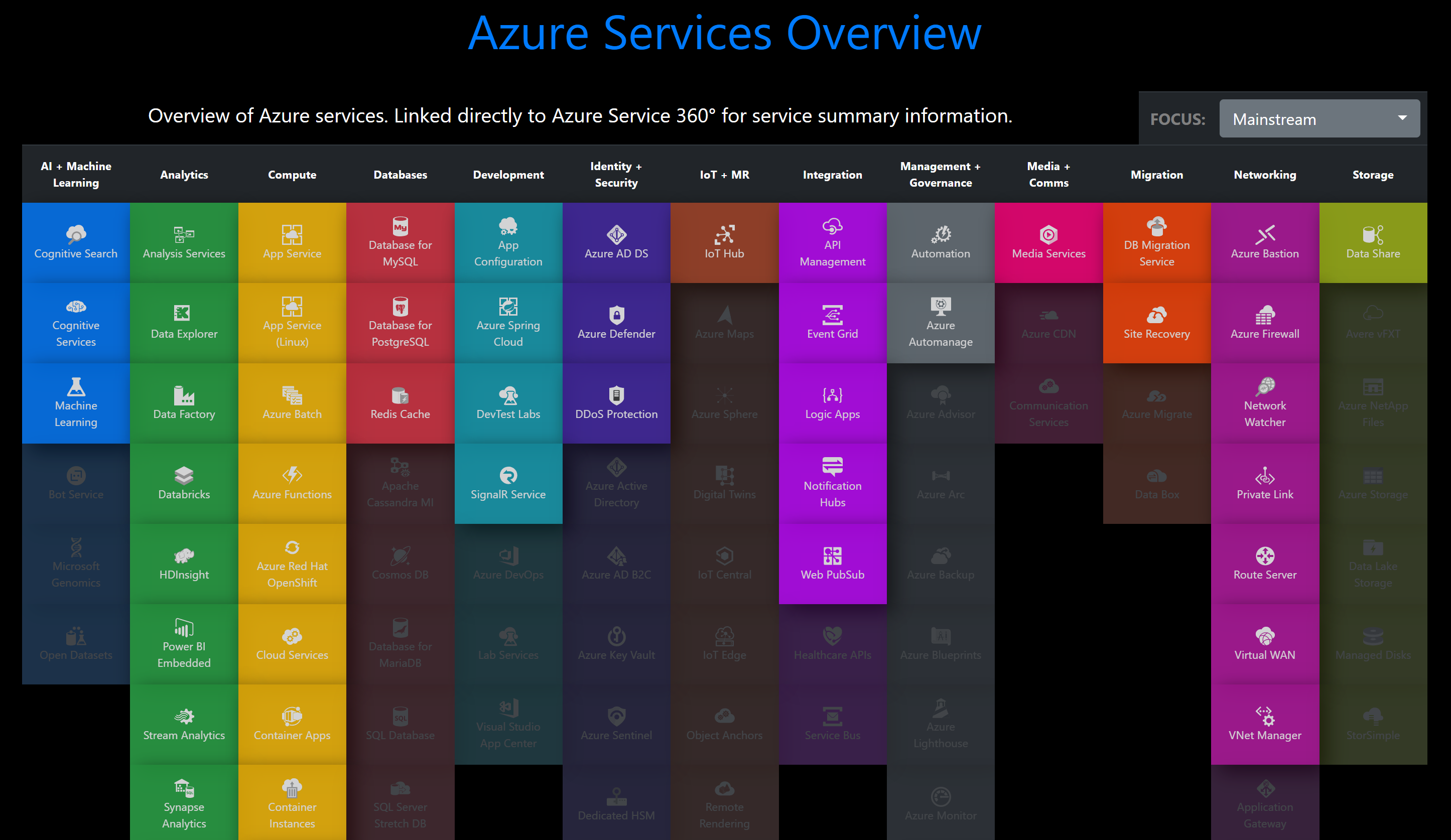
It basically allows you, as a user to visualize the different Azure services and to distill the information that you need in a very approachable way. It provides you with easy to consume information for the different services, organized by category, on a plethora of domains:
- General overview (a link to detailed info per service)
- Update Information ➡️ Heatmaps in different areas (Cost optimization, Security, Reliability, Governance, ...)
- SLA information (per percentile)
- A time line for announced updates/services
- Regions (with the possibility to compare with other regions to determine parity)
- And of course the above mentioned reference architectures (solutions) (Here you can select the services that you need and you will be able to choose from some reference architectures, which can be found in the Azure architecture center, which was mentioned earlier)
- Published templates
On top of that, there's a lot of information to be found. All this information is put at your fingertips, making your lives/work/research/learning process/... a lot easier and definitely more fun/interesting!
I really like the idea/concept and look forward to what the future brings! Do give it a try and make sure to also give Alexey feedback, I'm sure that he'll appreciate it!
Enjoy!